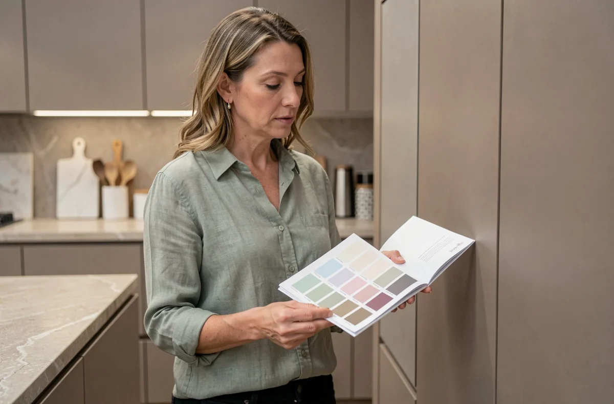
At Schmidt, the color chart is not just a grid of shades classified by family. Each color is available in several finishes (matte, satin, glossy, textured), and it is this combination of color and finish that determines the actual appearance on a kitchen facade. Choosing a color without considering the finish means validating a project based on only half of the parameters.
Matte, glossy, or textured finish: the impact on the perception of Schmidt colors
A glossy facade reflects light and can visually brighten a small space. The same shade in a matte finish diffuses light, appears darker in a poorly lit room, and better hides fingerprints.
In a south-facing kitchen or one facing a bay window, glossy facades multiply reflections. Daily visual comfort deteriorates if this parameter has not been anticipated. Conversely, in a north-facing garden-level kitchen, a glossy finish compensates for the lack of natural light.
Textured finishes (wood effect, polished concrete) add a tactile texture that further alters the perception of color. A structured anthracite gray does not produce the same effect as a matte lacquered anthracite gray. We recommend always comparing at least two finishes for the same color before making a decision.
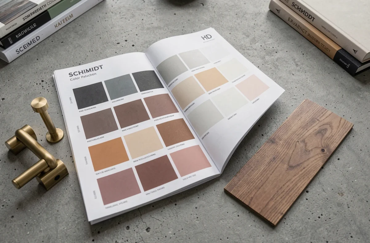
To explore all the available references, the Schmidt kitchen color chart allows you to visualize the color-finish combinations offered by the brand and refine your selection before an in-store appointment.
Color of kitchen facades and existing floor: the constraint that the color chart alone does not solve
The floor influences the choice of colors more than a general trend. An ivory travertine tile does not call for the same facades as a gray or honey travertine. The more the floor presents natural variations, the more facades benefit from remaining understated to avoid visual overload.
This logic applies to all types of flooring:
- A light oak parquet (honey to golden tones) supports sage green, off-white, or pearl gray facades without color temperature conflict.
- An anthracite porcelain stoneware floor opens the door to more saturated facades (navy blue, terracotta, forest green) because the light-dark contrast structures the space.
- A uniform beige tile tolerates almost all colors from the Schmidt color chart, but shades too close to beige create a flat monochrome effect, lacking depth.
The common trap is to choose a facade color in the showroom, under standardized lighting, without a sample of the actual floor. A sample test must be done in the room, placed against the floor and observed at different times of the day.
Matching Schmidt shades with walls and countertops
The Schmidt color chart covers broad families: neutrals (whites, grays, greiges), bold colors (blue, green, terracotta), and wood or material decors. The choice of walls and countertops radically transforms the perception of the same facade color.
Temperature of artificial light
A cold-dominant LED lighting pulls warm shades towards dullness, while warm light enriches wood or terracotta facades but can yellow a pure white. Testing the color under the final kitchen lighting avoids unpleasant surprises upon delivery.
Countertop and backsplash as a binding element
The countertop occupies a continuous horizontal surface that serves as a transition between the lower and upper cabinets. When the facades are in a saturated shade, a countertop in a neutral tone (white quartz, light oak laminate) absorbs the color density and prevents the “color box” effect.
The backsplash plays a similar role vertically. A patterned cement tile backsplash imposes solid facades. Two-tone facades (colored lower cabinets, white columns) work better with a subdued backsplash.

Validation method before ordering: avoid screen-reality mismatch
Digital catalogs and online configurators remain orientation tools. The calibration of each screen distorts shades, sometimes significantly. An olive green displayed on a poorly calibrated screen can turn khaki or bronze.
The reliable method follows a precise order:
- Preselect two to three colors from the digital color chart to narrow down the choice.
- Request physical samples in the Schmidt store. These facade plates reproduce the actual shade and finish.
- Place each sample in the kitchen, against the floor and wall, and observe the rendering in natural light in the morning, then in artificial light in the evening.
- Compare the samples with each other in the room, not in the store. The showroom’s lighting environment never replicates that of a lived-in kitchen.
This step takes a few days but secures an investment that commits the kitchen for many years. A perceived shade mismatch after the facades are installed can only be corrected by replacing the facades, an avoidable extra cost.
The choice of a Schmidt color is less about the current trend than about the coherence between the finish, the room’s light, and the materials already in place. Validating a color in situ remains the only guarantee of a result faithful to the project.